Cetinje Polyclinic
Cetinje Polyclinic
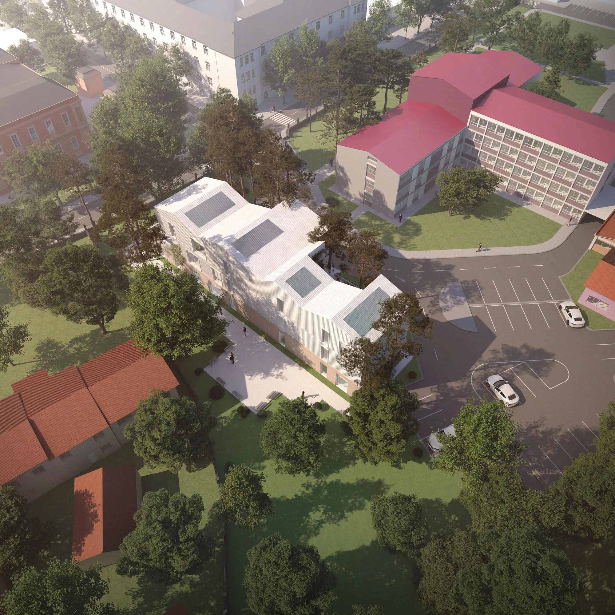
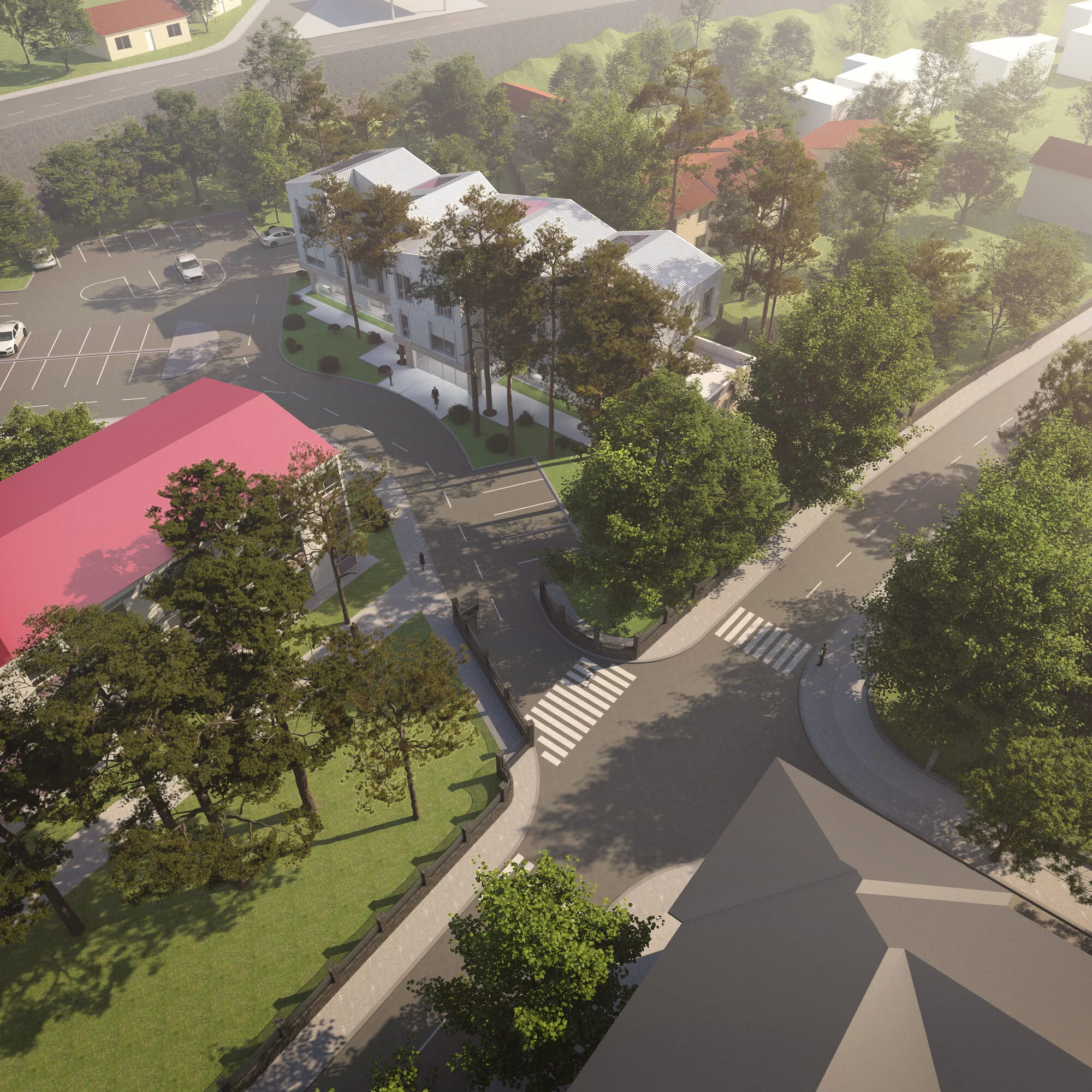
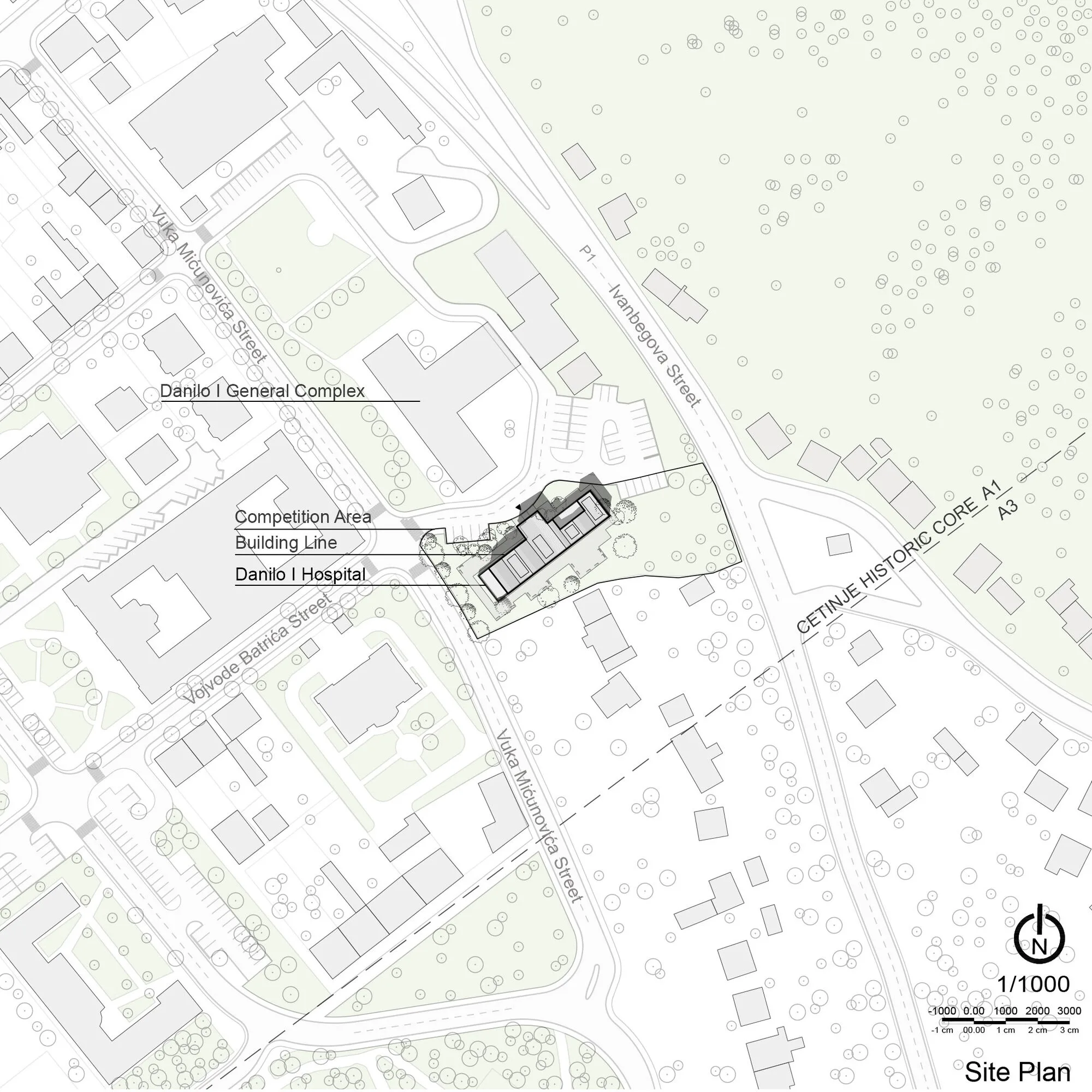
The design area is situated at a relatively serene level on the periphery of the seemingly dense texture of the city of Cetinje. Within the existing hospital complex, the area faces the main structure used for versatile medical interventions and treatments, positioning itself as a candidate for an independent-scale design.
To the north, the area is surrounded by a high retaining wall overlooking "Ulica Grahovska (See Grahovska Street)." In terms of perceptual orientation, the design area is enclosed to the north by a highway retaining wall significantly higher than the human scale. In other words, there is no direct connection to the mentioned "Ulica Grahovska (See Grahovska Street)" in the north. Access to the design area is actually provided from the south, through "Ulica Vuka Micunovica (See Vuka Micunovica Street)," immediately after accessing the building complex from this route, the design area is on the right.
The area is surrounded by an extensive plant periphery to the south, and the competition specifications already include mandatory insistence clauses regarding the preservation of this plant density. The facade facing the road is naturally the edge where the main approach will be taken.
Cetinje Polyclinic
Context
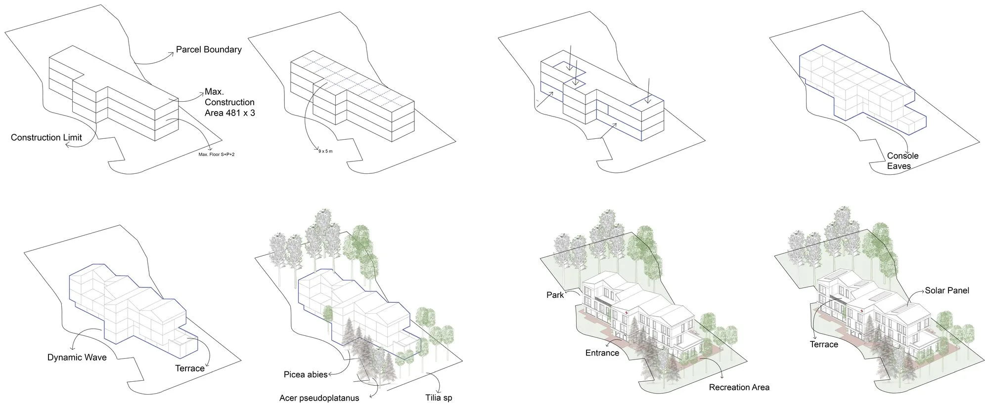
In essence, due to the cadastral data expressed in the competition specifications, the geometric application trace where the structure will be positioned and shaped is clearly defined. Moreover, the dense and detailed expansions of the spatial arrangements expressed in the "Program of Needs" cause the complete utilization of this cadastral trace. In this context, the aim is to achieve architectural maturity with richness sought in the third-dimensional perception and detail depth.
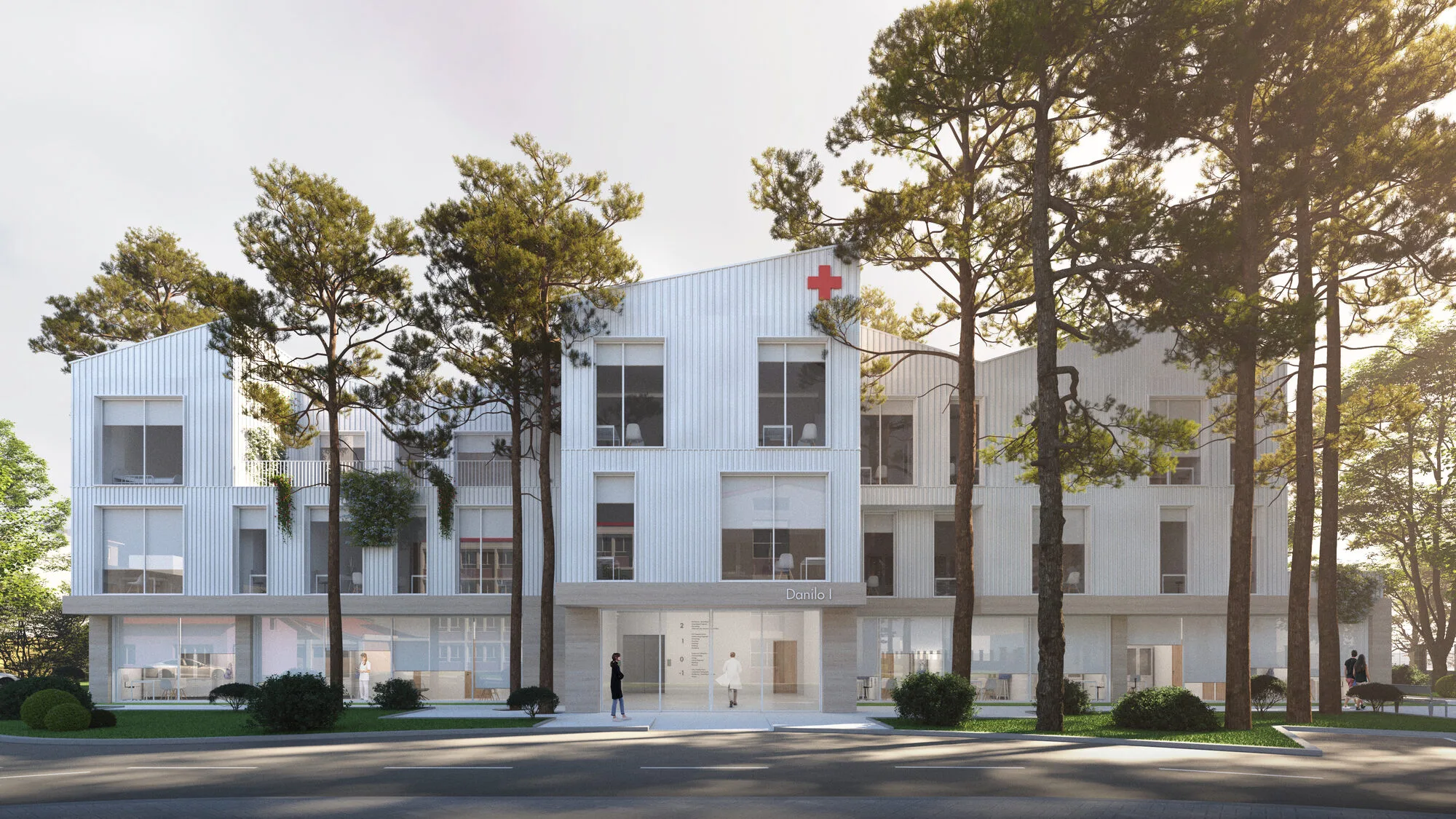
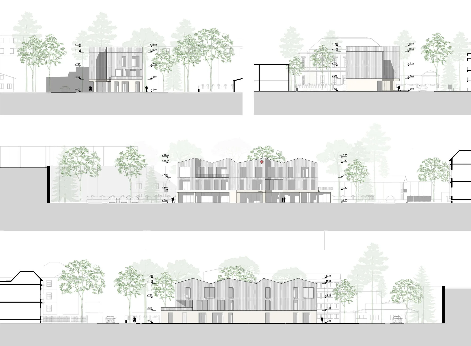
Upon examining the existing building inventory in its immediate vicinity, it is observed that there are certain structural tendencies that impart a characteristic style to the city of Cetinje. For instance, architectural trends such as steeply inclined pitched roof series, compact facade design with reduced surface area, and the use of simple and refined materials are quickly noticeable in the built environment.
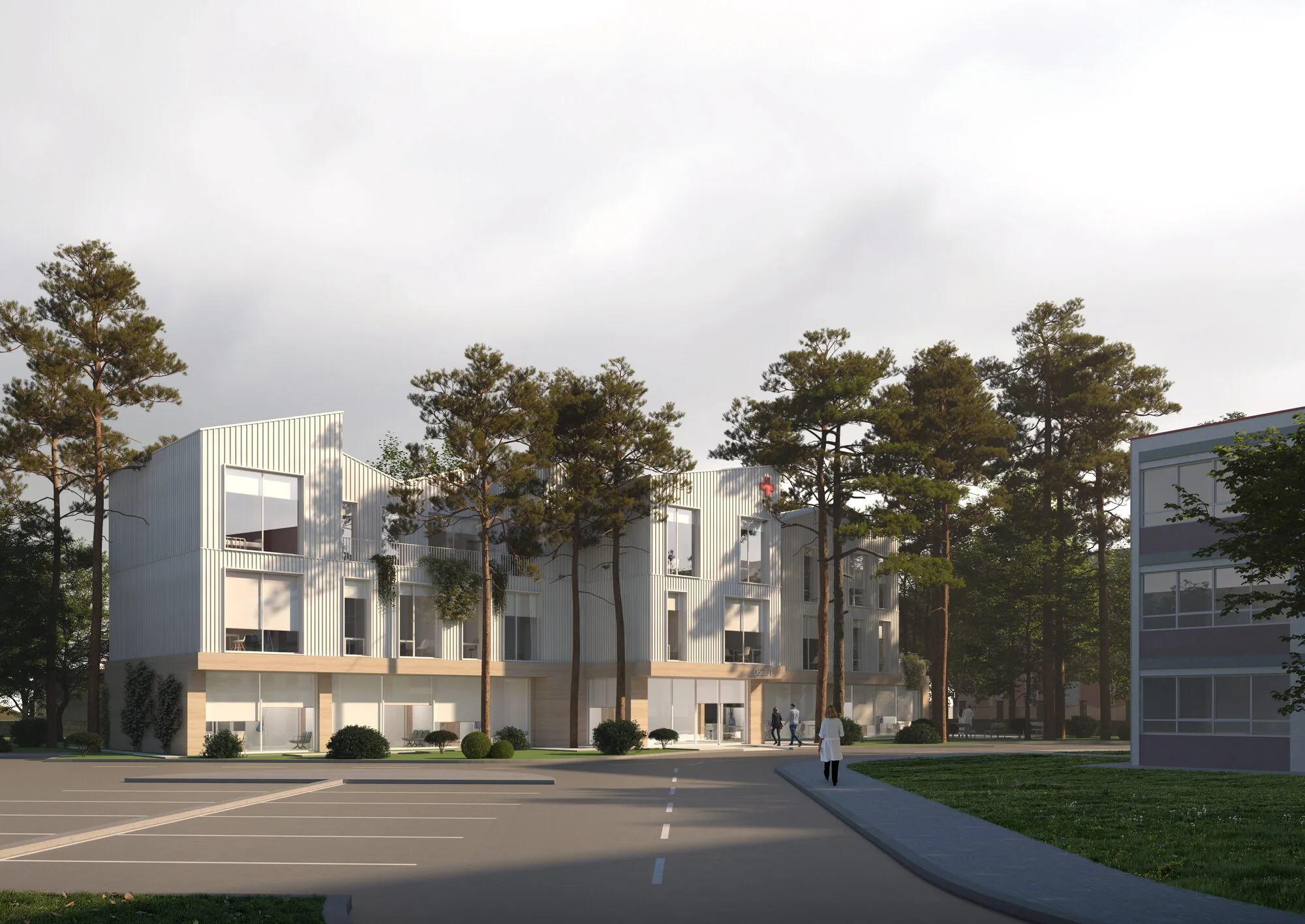
Similarly, the application trace of the existing and still-operating structure within the complex, positioned in a "T" geometrically aligning manner, inevitably directed the designers towards a dominant facade layout in line with this trend and focused on the resulting support zone. For example, the two faces facing each other, which are likely to be the main entrances of both structures, will facilitate the "Wayfinding" concept for hospital users and provide ease of use within the complex's internal ergonomic orientation.
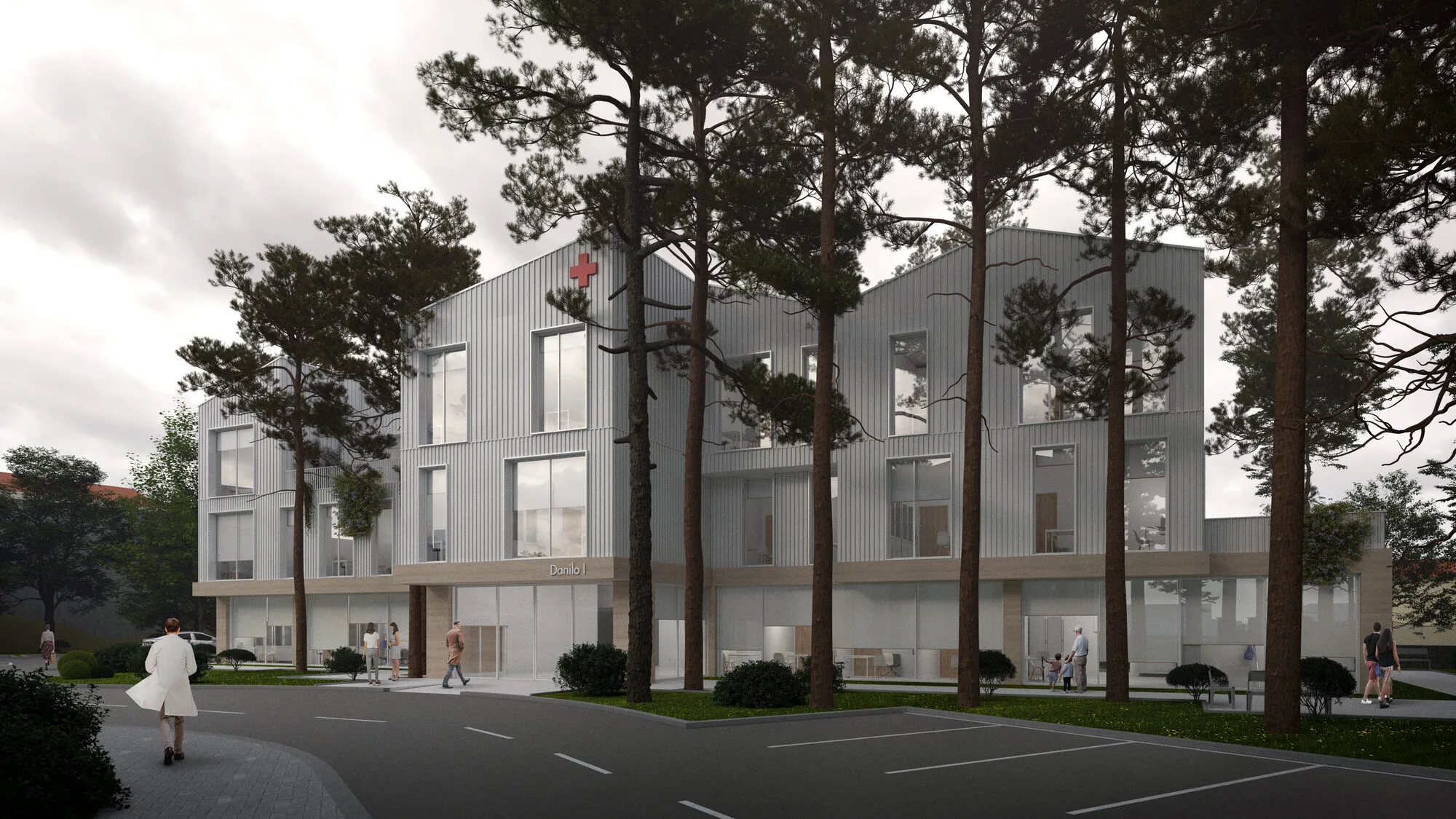
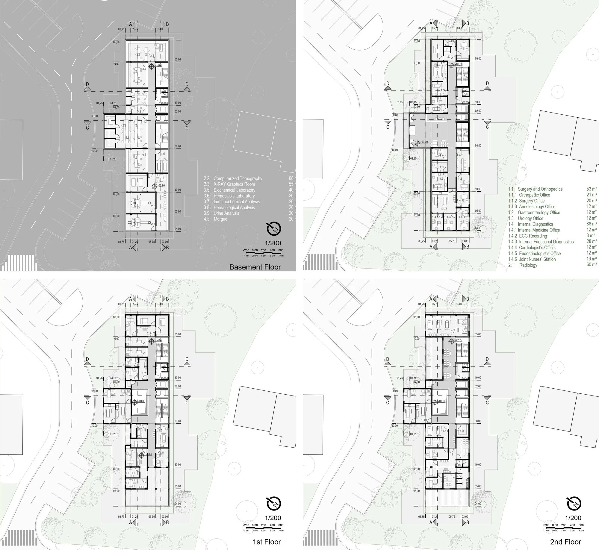
On the other hand, adhering to the essential criteria for proper orientation within a hospital structure, the planning of the structure is designed as compartmental units attached to a circulation spine. To optimize other physical conditions that the local geography will lead to on a scale guided by local architectural requirements, a pitched roof has been chosen, and appropriately sized windows have been opened on the facade to prevent possible snow accumulation. As described earlier, this pattern, already read in the nearby built environment, has become an inherent aesthetic attraction of the structure, evolving into roof forms with upward extensions, moving away from eave-like appendage elements. Another crucial point to mention here is the consideration of integrating the short side facing the "Road Retaining Wall" as much as possible with the internal wet volume and circulation-weighted center of the structure and/or surrounding it with lower spaces requiring closed volumes, such as "Radiology" services.
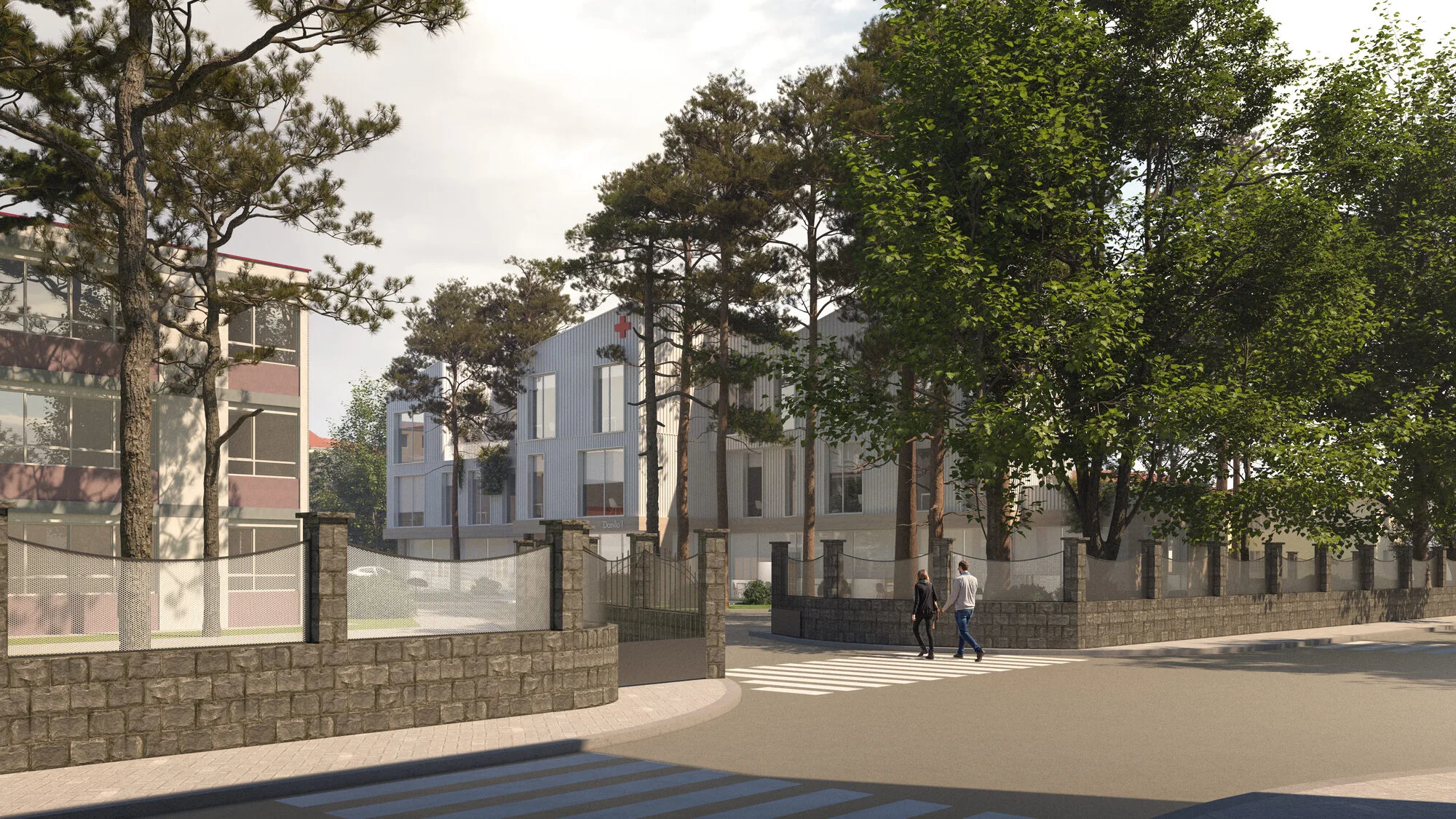
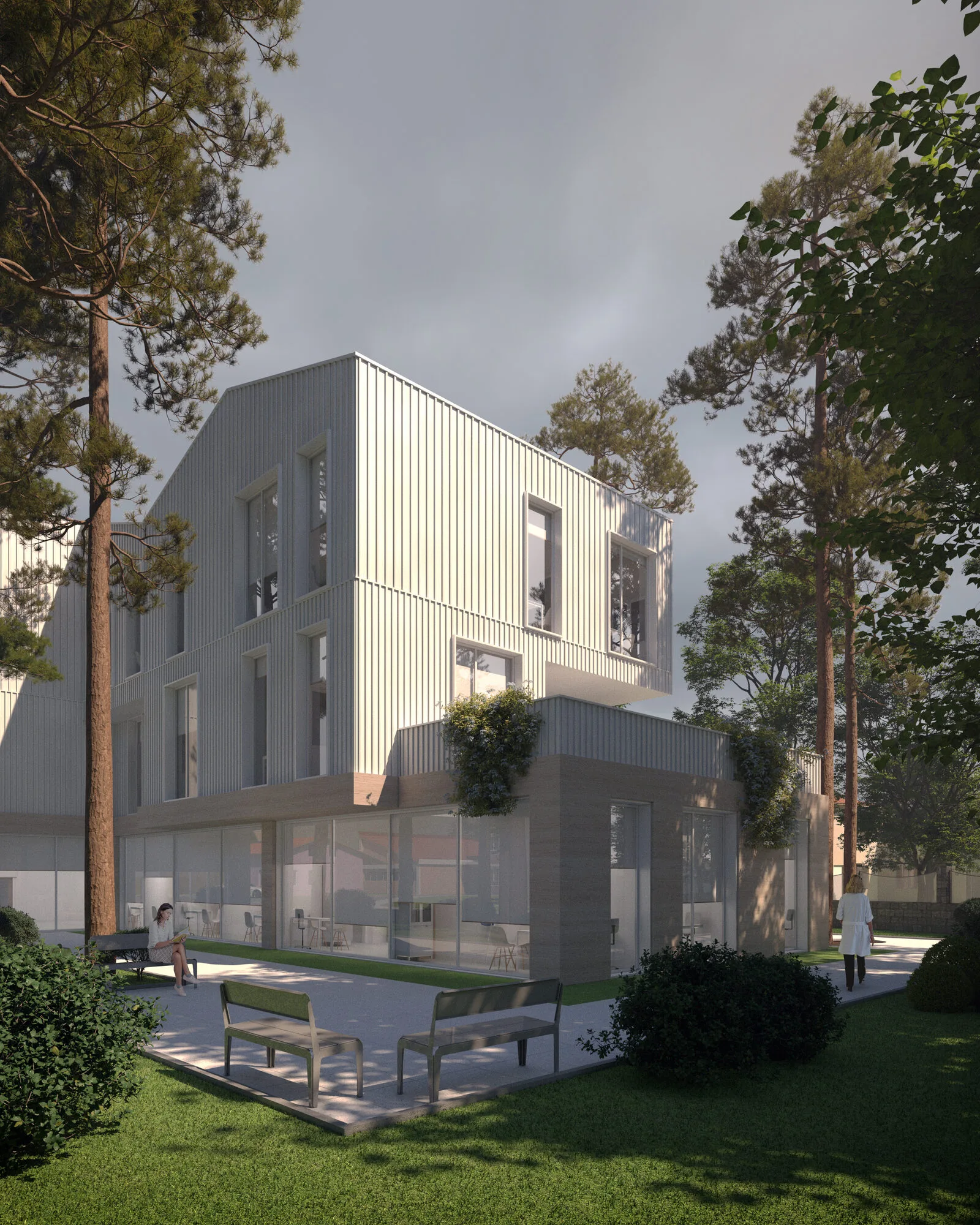
Certainly, one of the drawbacks of this situation is the risk of aesthetically perceiving the structure's initially intended simple geometric trend as visually uniform shallowness. In other words, the effort to define this integration with clear and prime geometries, with prismatic rises, can ultimately result in a product that does not promise spatial richness. To overcome design challenges like this, the main shell, especially on the side facing the complex hospital interface, has been differentiated at local points with various dynamic movements on the facade surface. Terrace areas revealed in some places have been transformed into "Accessible Rest/Recreation Stations."
Program
In parallel with all the interventions described in the structure's roof, the necessity of how the operation should be ergonomically and functionally designed together has been discussed among the designers. One of the topics the design team unanimously agreed upon is the need to support the dynamic effect created on the facade with voluminous and perceptually impactful voids, such as a "Gallery," to be recreated in the interior. For instance, the same "Gallery" trace, positioned almost at the center of the structure, turns into a requirement that separates potential sub-departments from each other and includes resting/seating stations along its own route.
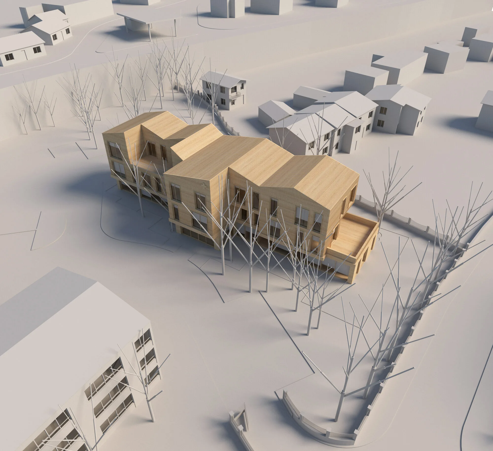
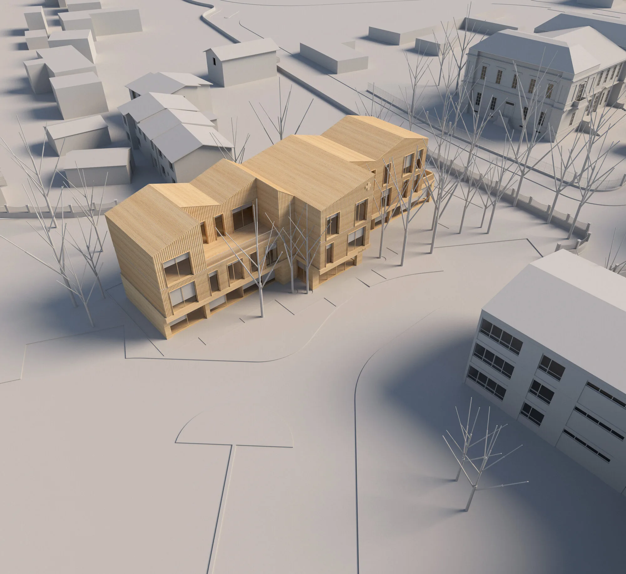
The geometric positioning of the cadastral application trace in a "T" shape inevitably indicates from which point on which side the main approach should be taken. This "T," a short-sized projection that stands out with its emphasized stance, is almost a showcase-like entrance element that is likely to be the first attention-grabber for the urban user, constituting the initial phase of the process of engaging with the structure. Moreover, the long body part dominating the other dimensions of the structure is located behind the dense-leaved trees in its immediate vicinity. Similarly, the gallery described above is positioned behind this entrance.
One of the key expressions frequently mentioned in the "Needs Program," the necessity for the central operation/ density flow to be between the Central Laboratory and Radiology Services, has always been a guiding principle in design and program interpretation. Additionally, the advantage of the sheltered area provided by the massive facade facing the highway retaining wall has led to placing almost all "Radiology" subspaces on this side on almost every floor. Again, adhering to the same guideline and in a manner that will facilitate the rational passage of potential hospital users/patients through the internal sequence of focal points, "Laboratories" (the majority) have been integrated into the Basement Level.
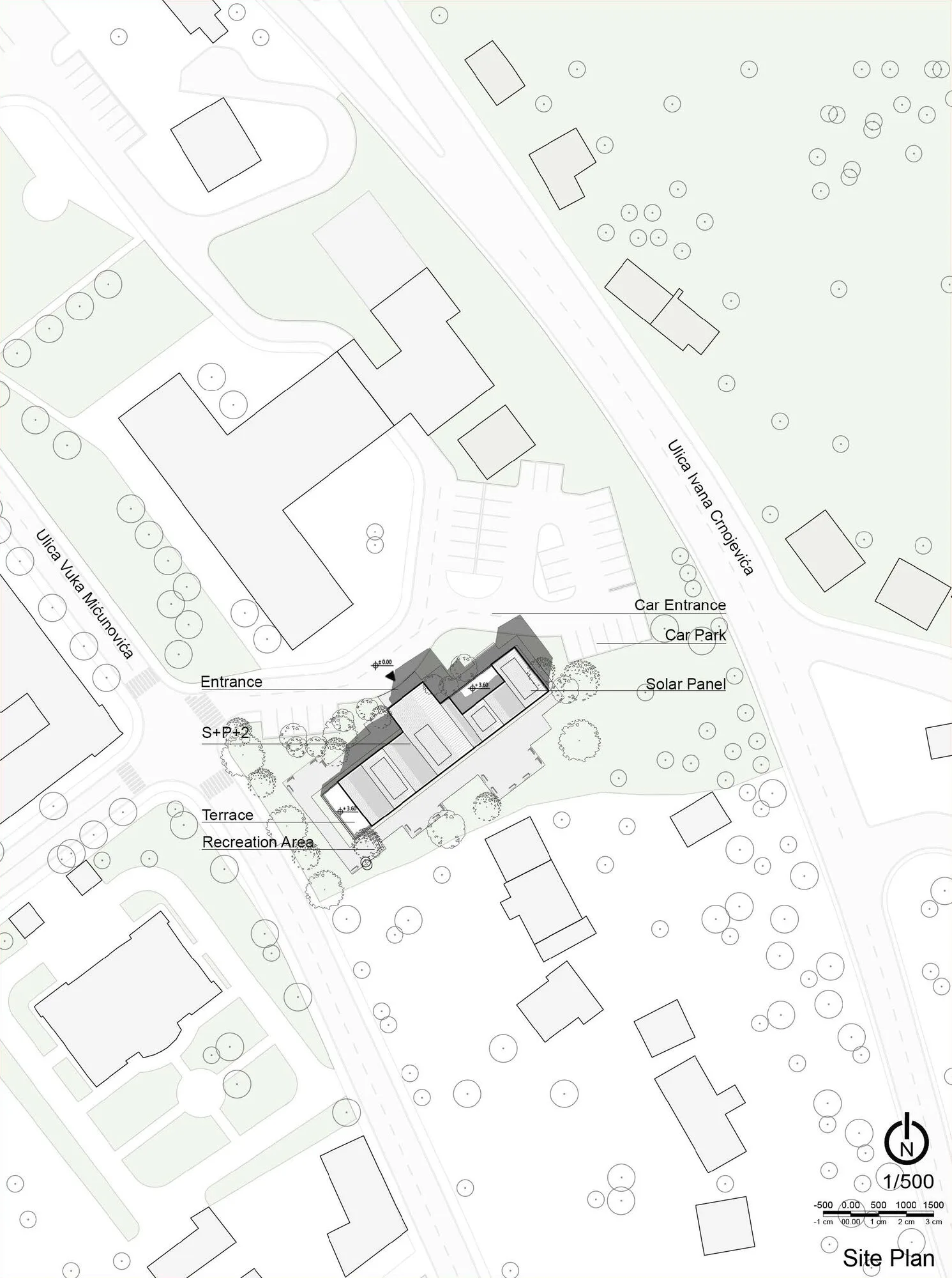
In fact, with a very rational tendency, it can be said that the placement of the remaining services and departments has become inherently easier with the configuration of subspaces such as "Radiology," "Laboratories," "Gallery," and "Building Core" in the volume that emerges. For example, by relocating some private patient toilets, nurse stations, and spaces that do not require natural light, such as test result and blood sampling areas, to the rear facade, all other services in the remaining area have been easily interpreted. Meanwhile, to achieve a compact service and department perception, "Nurse Stations" have been positioned in the support areas created by these services, which are considered or related, expanding the scope of the medical intervention team.
Material
The structure consists solely of a high-ductile reinforced concrete frame supporting system. To cope with the challenges posed by the seasonal and daily temperature variations brought about by the continental climate, a compact configuration and material palettes with high heat retention capacity have been chosen. In this context, trapezoidal sheet metal has been used for all floors above the ground floor, and insulation layers for preserving heat protection capacity have been depicted behind these sheets.
Another crucial aspect is the structure's ability to sustain interest among urban users and be perceptible in proximity to the hospital image. Therefore, the ground floor of the structure is surrounded by laminated and thermally treated wooden coverings. The balance of contrast between these two types of materials has also become an architectural attraction. Completing the design of the building envelope with various indicators, the structure's shell design is accomplished.

